
We did the sock design for the Aquaren company with pure pleasure. A dynamically developing company from Silesia, it wanted to emphasize its origin and the values it follows every day. Gryfne zoki – that’s what Silesians call socks, which was an interesting surprise for us. The design was made in the colors of the client’s logo with the main accent of the letter “Q”. The socks were prepared for our client’s biggest trade show as a unique gift. Unusual design and unusual challenge – something we love!
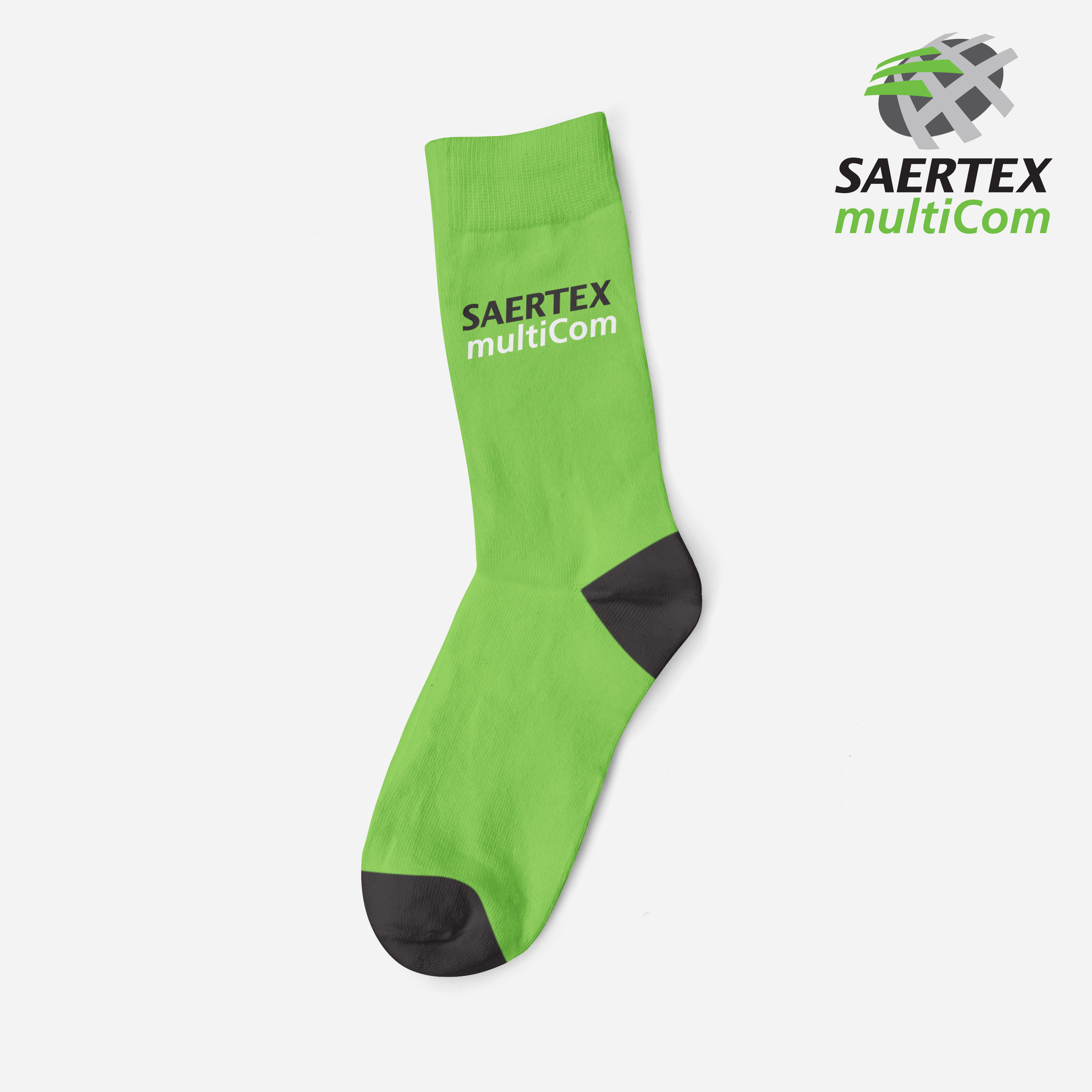
This time, we had the opportunity to prepare a project for our German partner Saertex Multicom.
The socks were prepared for one of the largest trade fairs in Germany as a gift for customers. Our client asked us for a design that was simple, but strongly emphasized the company’s characteristics and colors. As far as we know, the socks at the fair sold out like fresh buns.
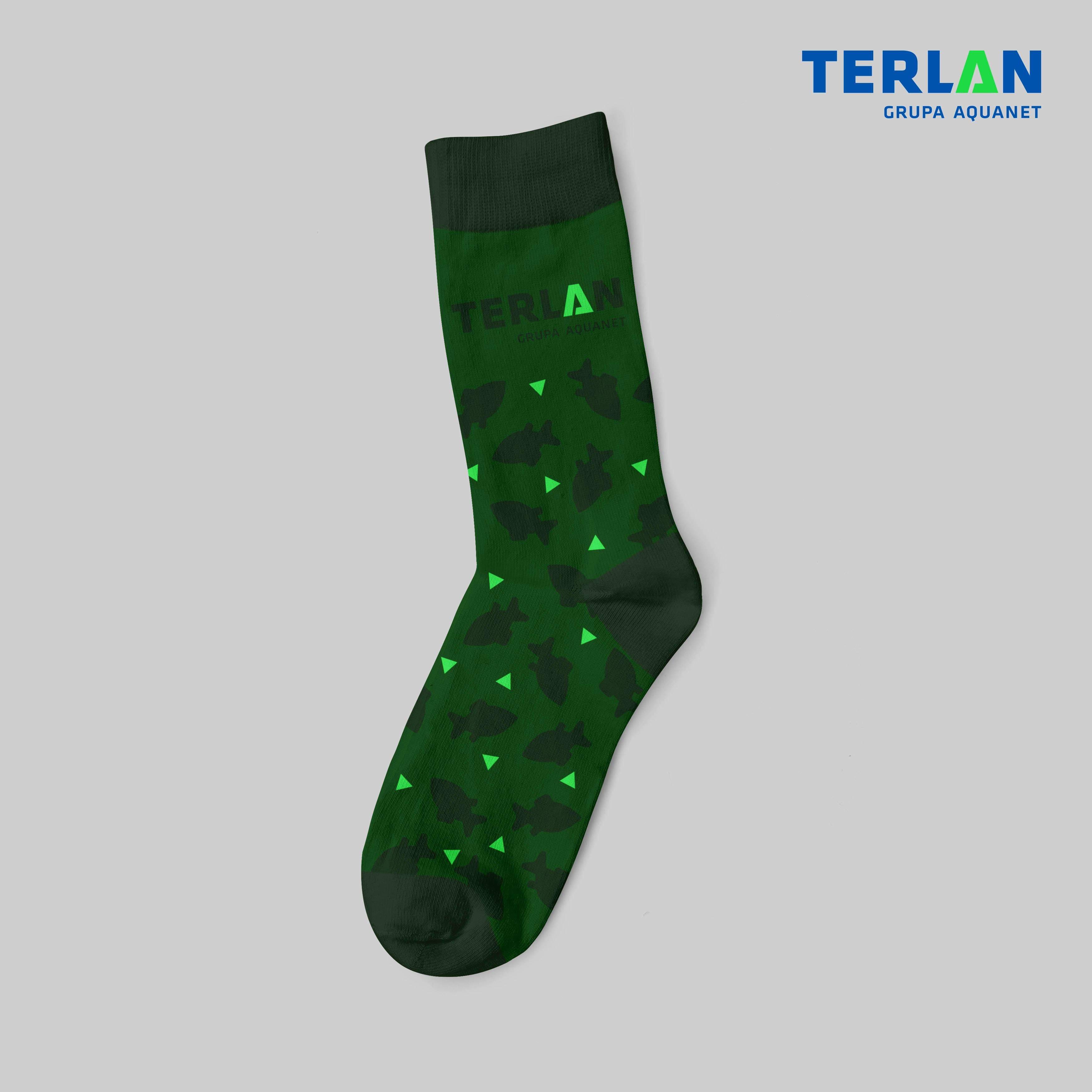
Another sock design, made for our Poznan client, Terlan. The socks were designed to be worn during business meetings, conferences and trade fairs. The dark green colors reflect the class and good taste of the person to whom the product is addressed. The fish that make up the sock’s main design is a reference to the company’s CEO’s name. A design that takes into account a great distance from each other, and at the same time a businesslike approach. The socks were used both as a gift for the company’s customers and as a gift for employees.
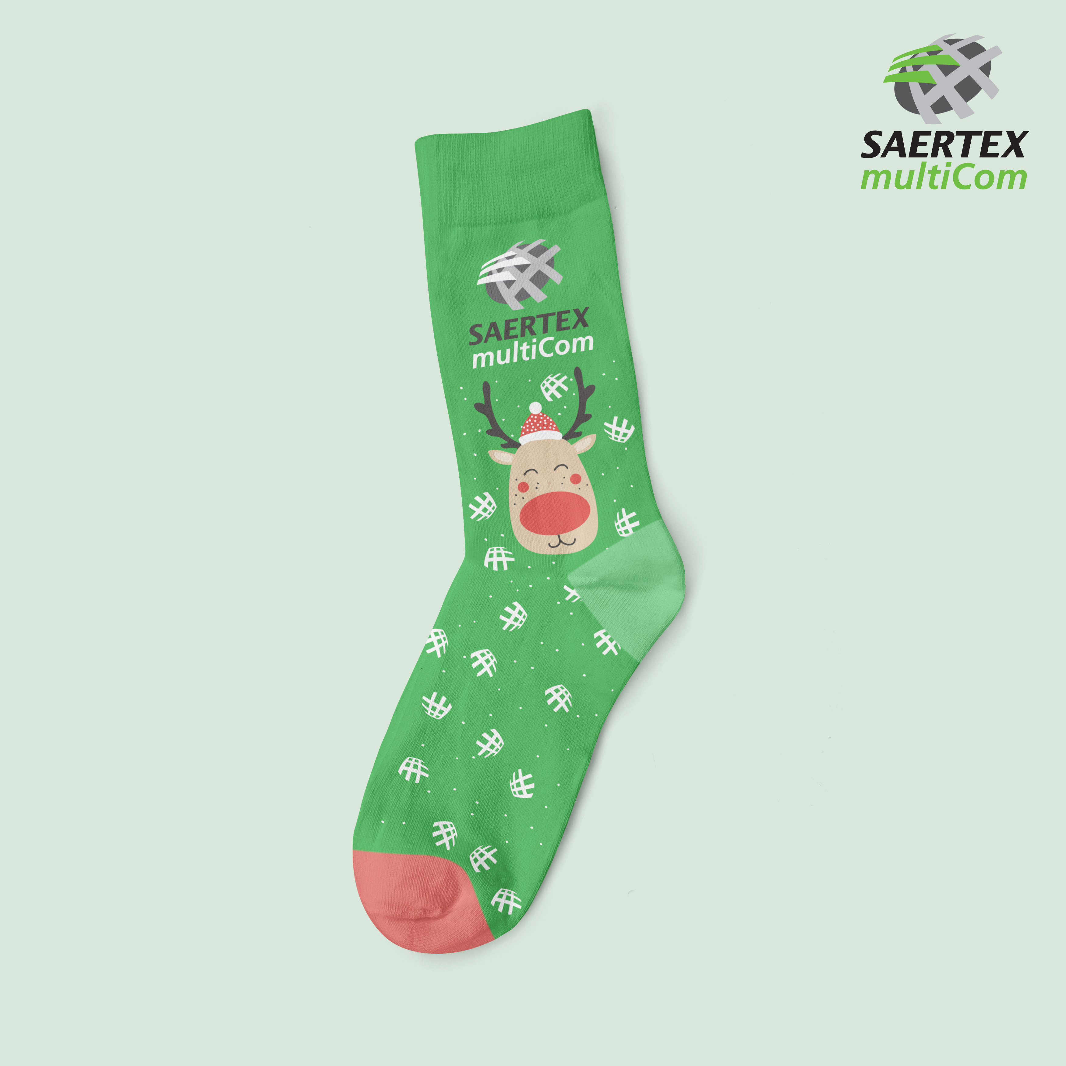
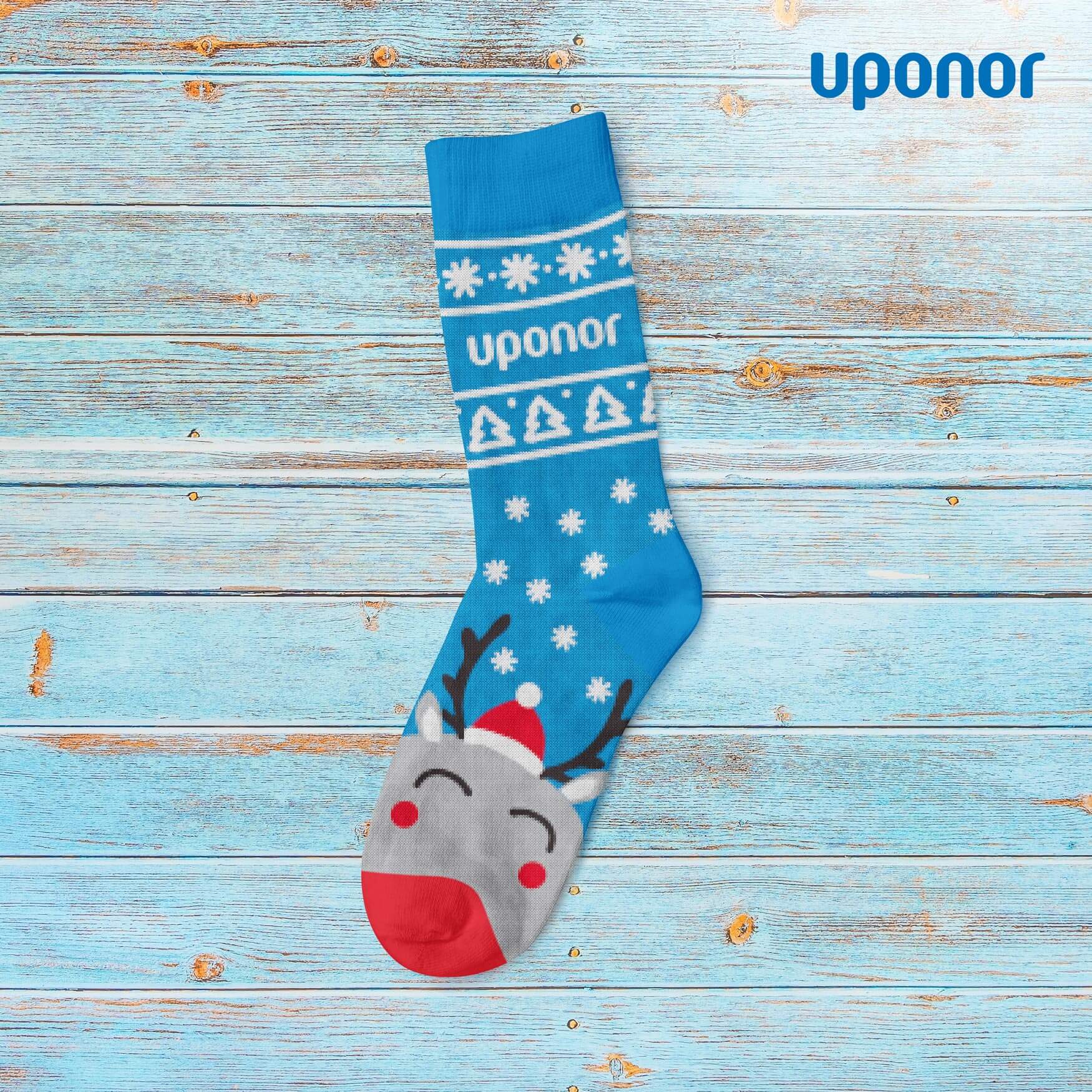
Another project for the German company Saertex Multicom. This time we were asked to create a Christmas sock design. The project was successfully executed and you have to admit that it looks insane… The main design of the sock, forms the stitch from which our client’s main product for the industry market is made. This is also the element that contains the logotype and which was particularly emphasized in this project.
The Christmas design, of course, could not miss a reindeer with a big red nose. The whole design blends really well, incorporating key elements of the client’s corporate identity and festive touches on the loose….
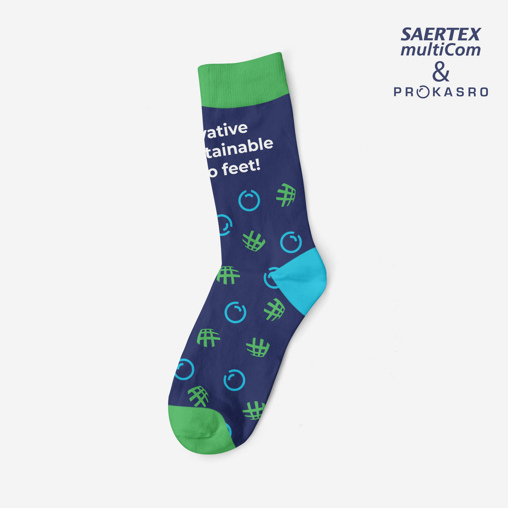
This sock design, came from the merger of two companies. The challenge was to think through the slogan and put two concepts and logos on one product. In the design, the main emblems of the companies that decided to enter into cooperation were used. By choosing the right color scheme and successfully combining all the client’s needs, we managed to create a perfect product of high quality and, above all, looking professional.
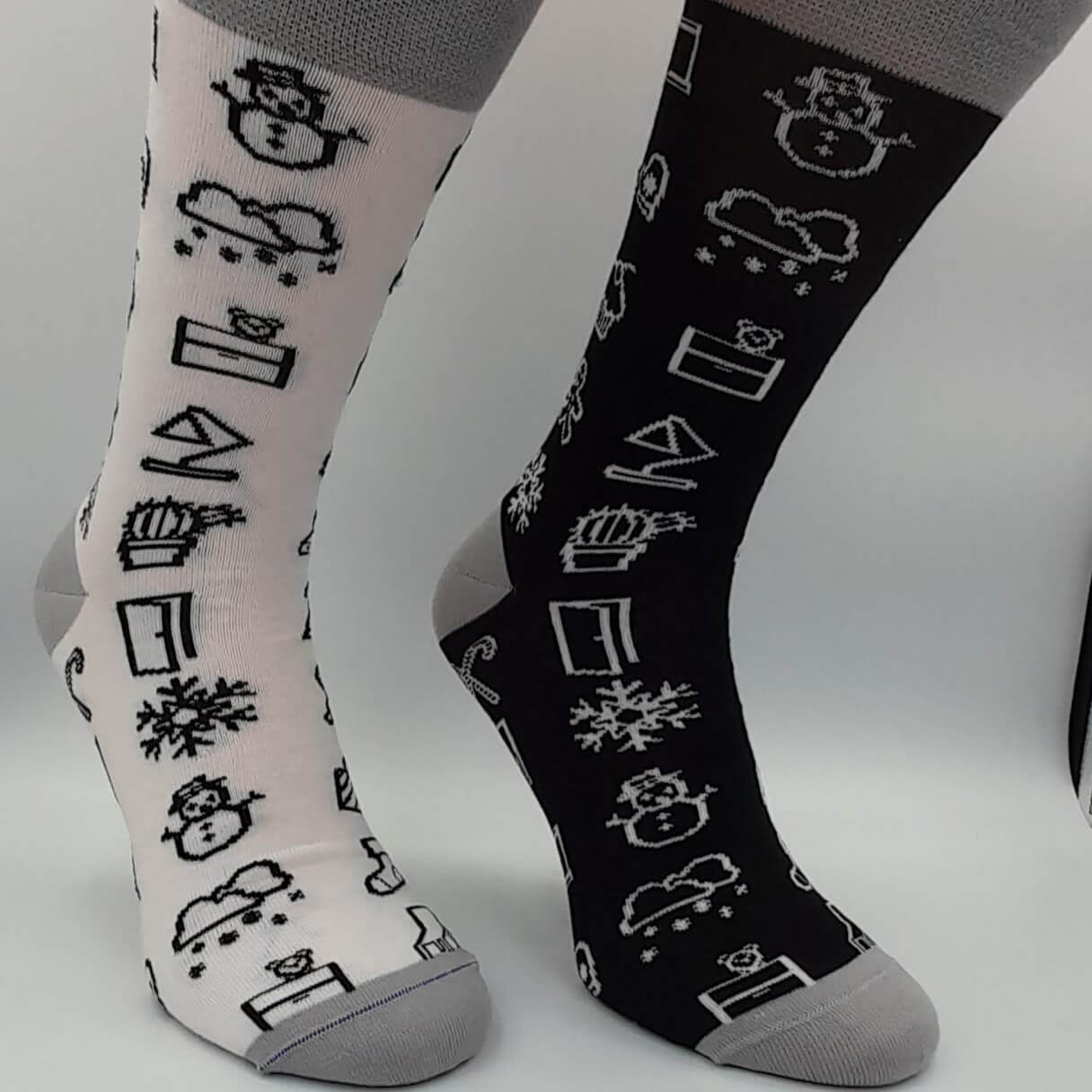
The sock design realized for the VOX furniture manufacturing company is an unconventional concept of using a black and white pattern with elements that are immediately associated with Christmas. This makes the whole thing a distinctive gift gadget and a nice gift for contractors.
We did the sock design for the Aquaren company with pure pleasure. A dynamically developing company from Silesia, it wanted to emphasize its origin and the values it follows every day. Gryfne zoki – that’s what Silesians call socks, which was an interesting surprise for us. The design was made in the colors of the client’s logo with the main accent of the letter “Q”. The socks were prepared for our client’s biggest trade show as a unique gift. Unusual design and unusual challenge – something we love!
This time, we had the opportunity to prepare a project for our German partner Saertex Multicom.
The socks were prepared for one of the largest trade fairs in Germany as a gift for customers. Our client asked us for a design that was simple, but strongly emphasized the company’s characteristics and colors. As far as we know, the socks at the fair sold out like fresh buns.
Another sock design, made for our Poznan client, Terlan. The socks were designed to be worn during business meetings, conferences and trade fairs. The dark green colors reflect the class and good taste of the person to whom the product is addressed. The fish that make up the sock’s main design is a reference to the company’s CEO’s name. A design that takes into account a great distance from each other, and at the same time a businesslike approach. The socks were used both as a gift for the company’s customers and as a gift for employees.
Another project for the German company Saertex Multicom. This time we were asked to create a Christmas sock design. The project was successfully executed and you have to admit that it looks insane… The main design of the sock, forms the stitch from which our client’s main product for the industry market is made. This is also the element that contains the logotype and which was particularly emphasized in this project.
The Christmas design, of course, could not miss a reindeer with a big red nose. The whole design blends really well, incorporating key elements of the client’s corporate identity and festive touches on the loose….
This sock design, came from the merger of two companies. The challenge was to think through the slogan and put two concepts and logos on one product. In the design, the main emblems of the companies that decided to enter into cooperation were used. By choosing the right color scheme and successfully combining all the client’s needs, we managed to create a perfect product of high quality and, above all, looking professional.
The sock design realized for the VOX furniture manufacturing company is an unconventional concept of using a black and white pattern with elements that are immediately associated with Christmas. This makes the whole thing a distinctive gift gadget and a nice gift for contractors.